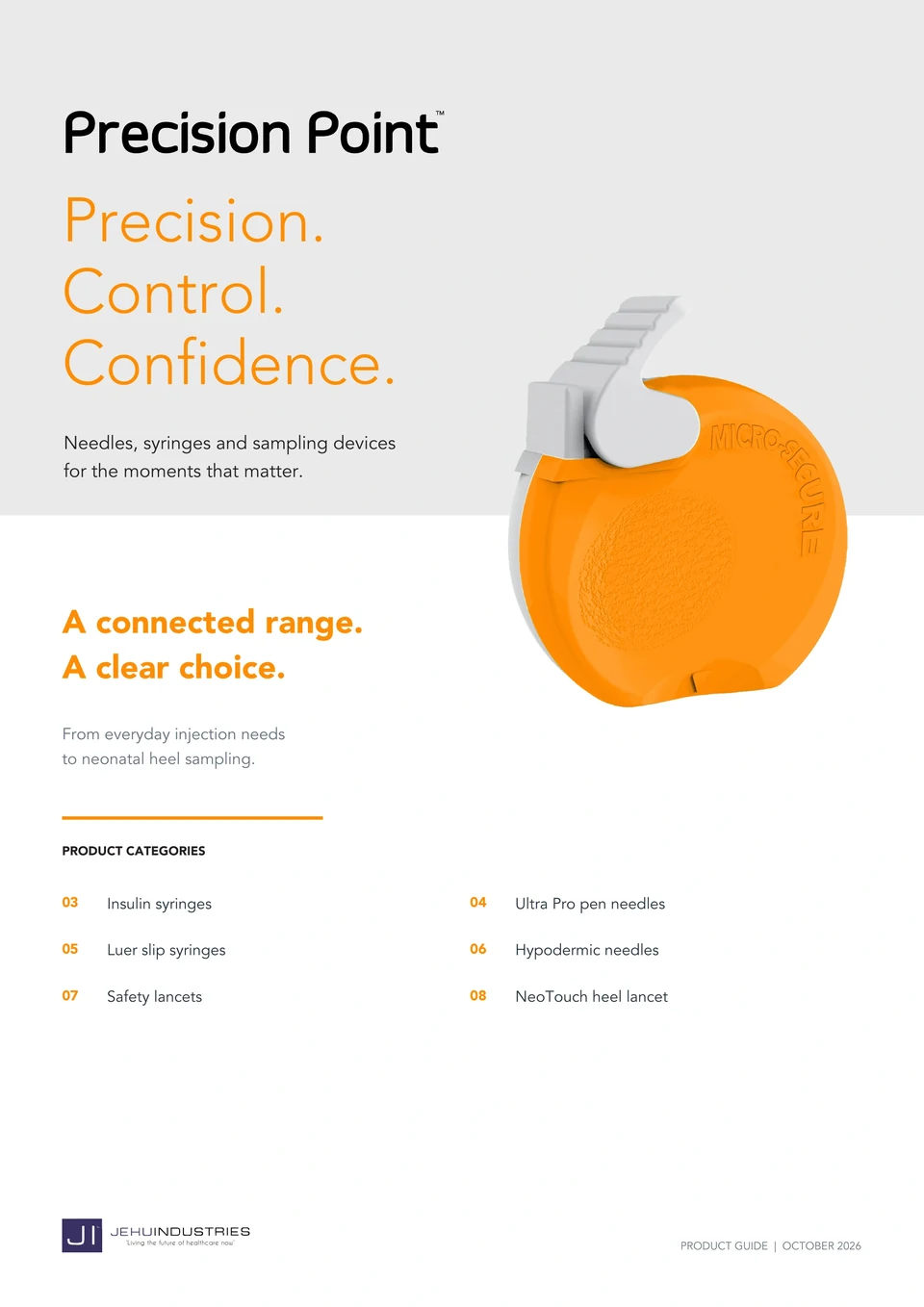
Original supplied October 2026 edition · 9 pages
The design challenge
Connect the overview to the exact product.
Six product categories need a shared structure without becoming visually interchangeable. The ordering guide provides the route into the range; each product page then gives the category its own focal point.
Read the publication01 / Design evidence
Give the reader two ways into the range.
The publication supports both an overview of the categories and a closer comparison of individual products.
 Read this page
Build a useful entry point
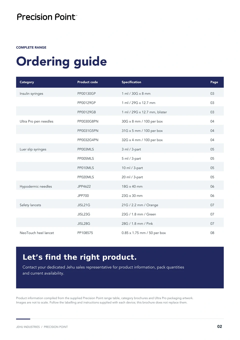
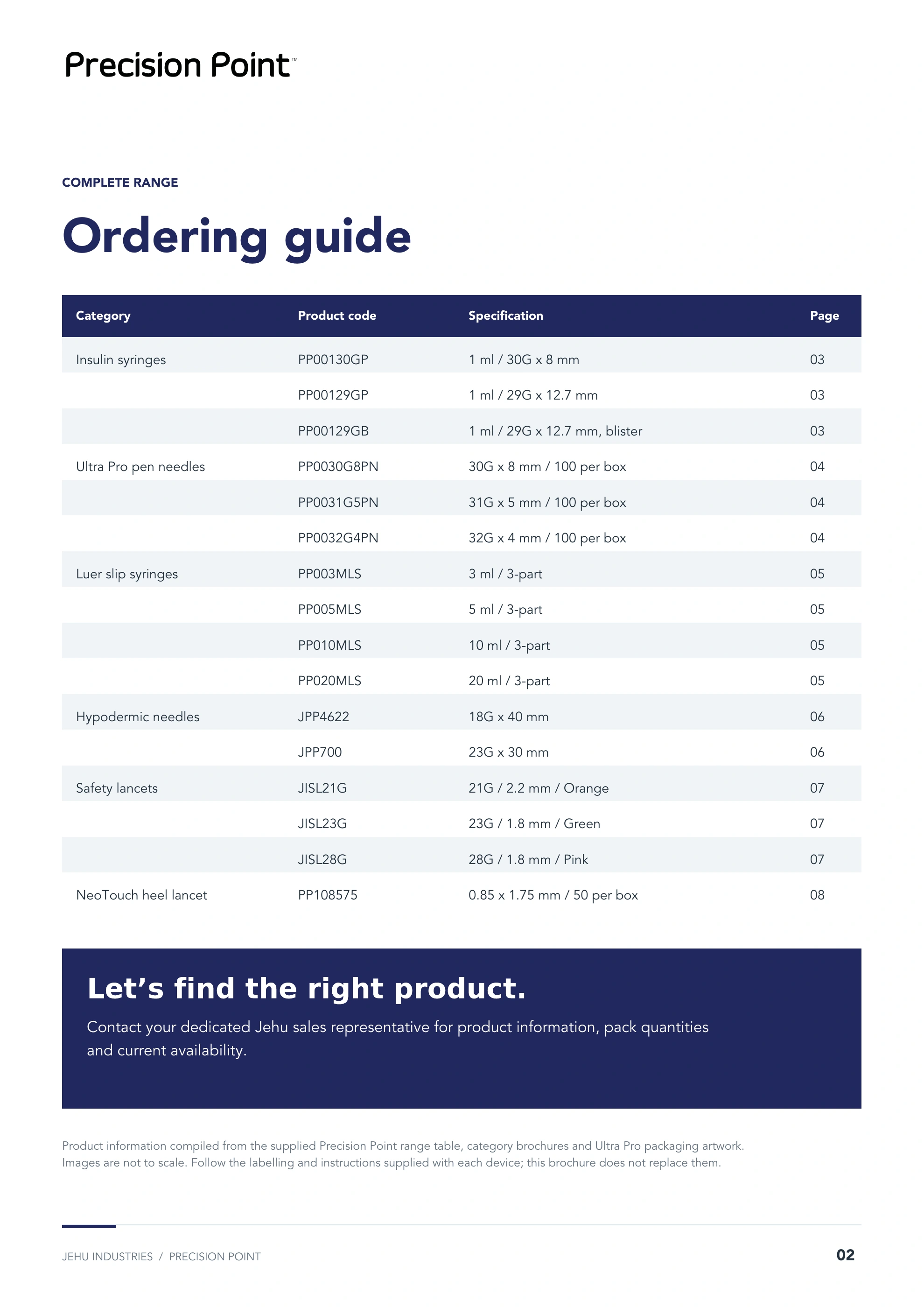
The opening guide collects product codes and page references in one place. Readers can begin with a category or with the reference they already have.
Keep the structure stable
Product title, main image, concise feature groups and a specification table repeat across the range. The order stays familiar as the product changes.
Use colour as a supporting cue
Orange, navy, aqua and pink give the categories distinct accents. Written headings and product names carry the distinction too, so colour is not the only cue.
02 / Design evidence
Make the critical difference visible.
The page system adapts to the information that matters for each product.
 Read this page
 Read this page
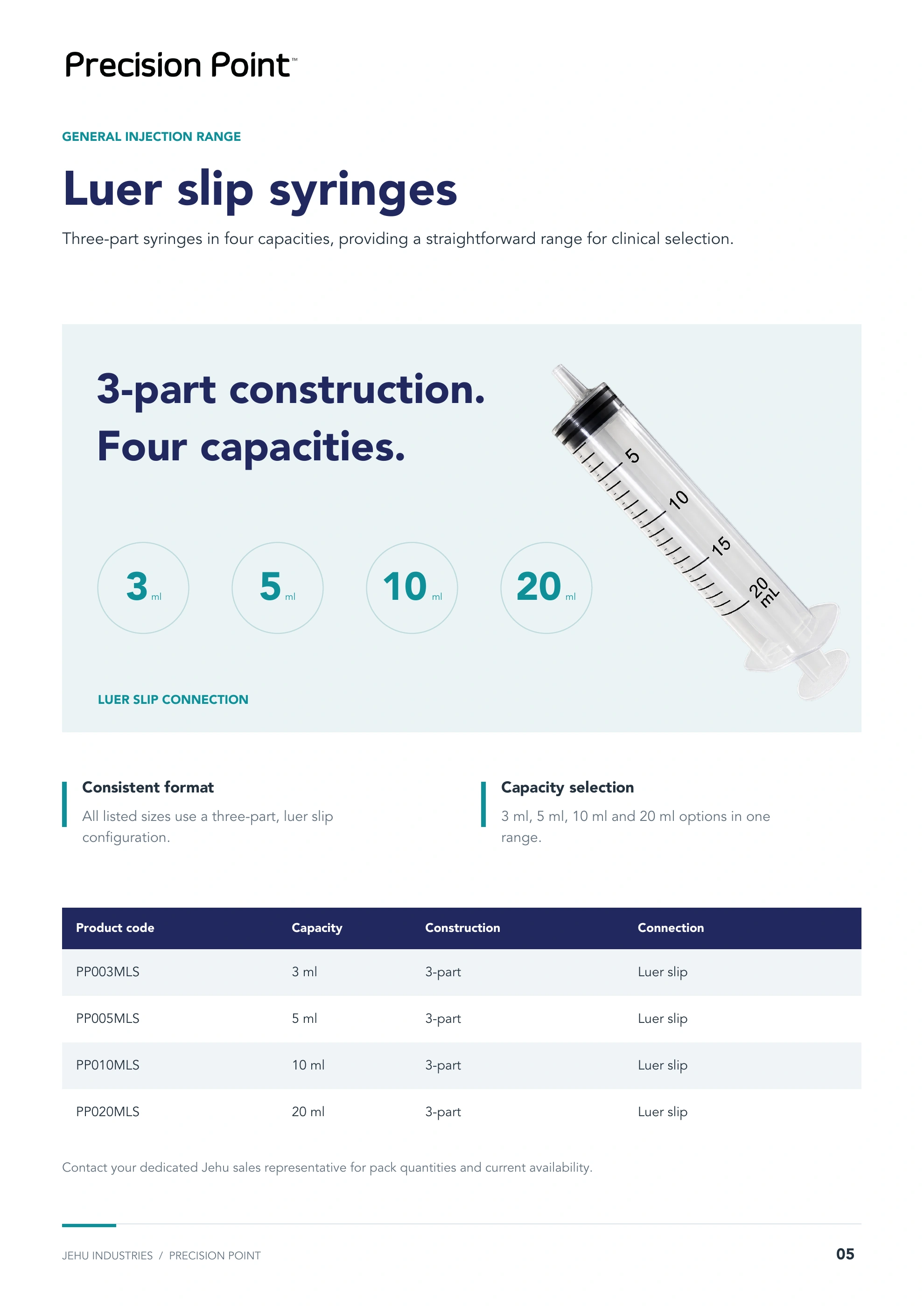
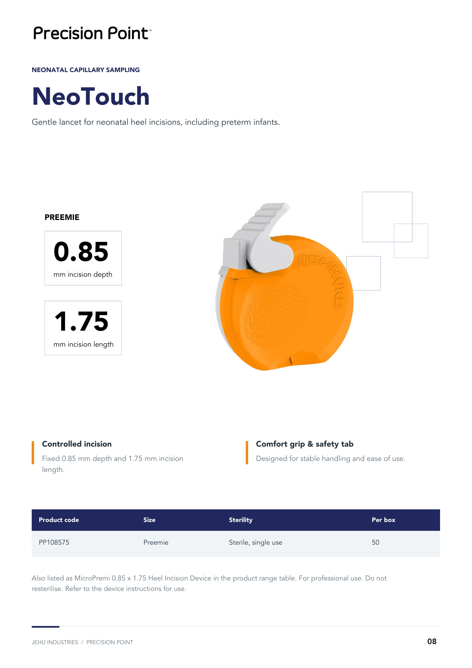
The syringe page makes capacity the comparison point. NeoTouch gives its two measurements separate positions beside the device. Consistency comes from the reading order, while the composition responds to the product.
03 / Design evidence
Inspect the complete publication.
The supplied edition remains intact, including the ordering guide and all six product categories.
Original publication · 9 pages
Precision Point Brand Brochure · October 2026
Open the complete edition to inspect the page sequence and detail.
Continue exploring
Explore the new product catalogue All brand projects Discuss a project