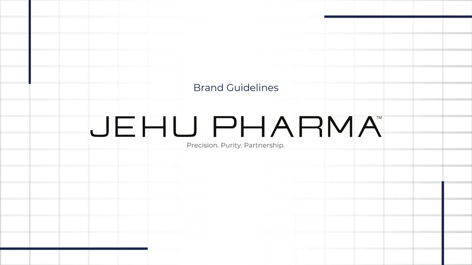

Original guide artwork and website concept · 2025
The design challenge
Turn a brand character into a usable system.
The guide defines precision, purity and partnership as the brand character. The design task is to carry that character into consistent rules for typography, space, imagery and application.
Read the selected guide (opens in a new tab)01 / Design evidence
A system built around restraint.
Each visual choice contributes to the same character: ordered, open and precise.
 Inspect artwork
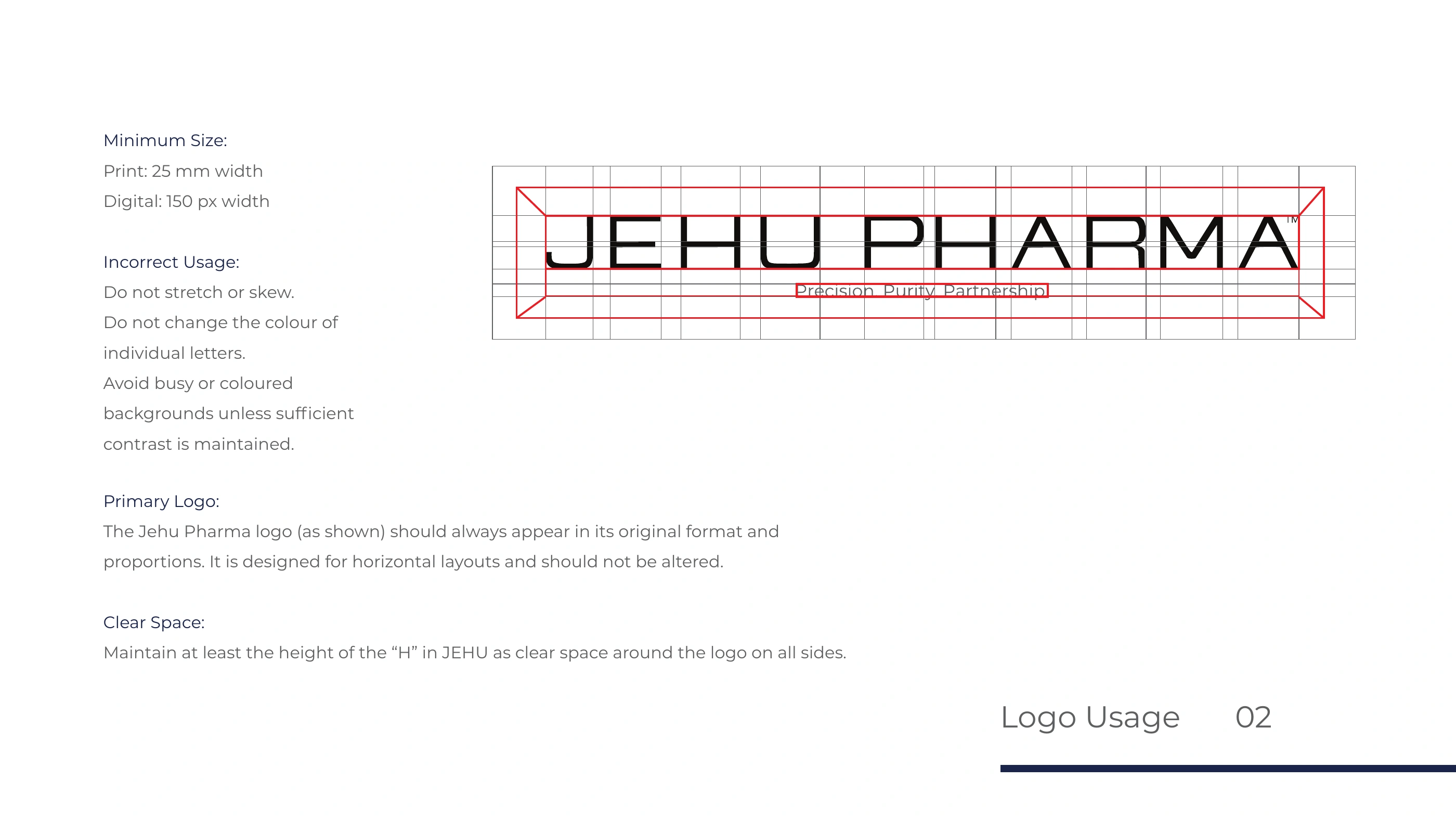
Protect the horizontal signature
The wide wordmark depends on breathing room. The guide pairs minimum sizes with a clear space rule so it remains legible when it moves into a denser layout.
Give alignment a visible language
Fine grid lines and navy rules echo the horizontal construction of the wordmark. Repeating them in the guide and website concept connects the system without adding another decorative motif.
Separate hierarchy from decoration
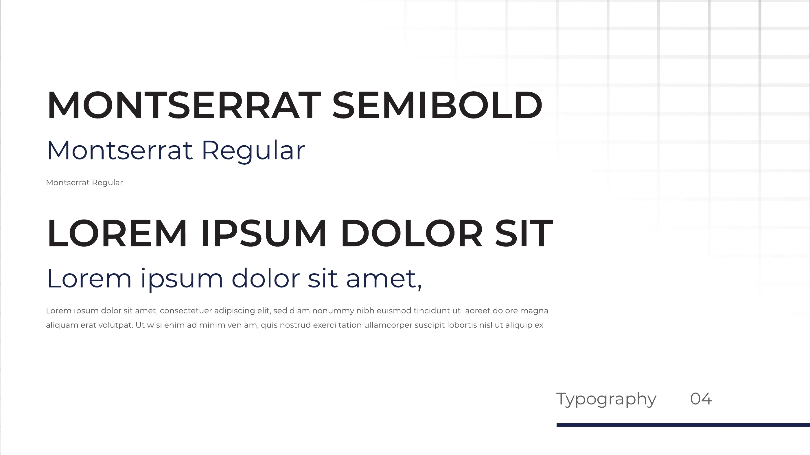
Montserrat weight changes establish the title and body relationship. Most of the field stays white, allowing the wordmark, images and key headings to carry the attention.
02 / Design evidence
From rules to a digital concept.
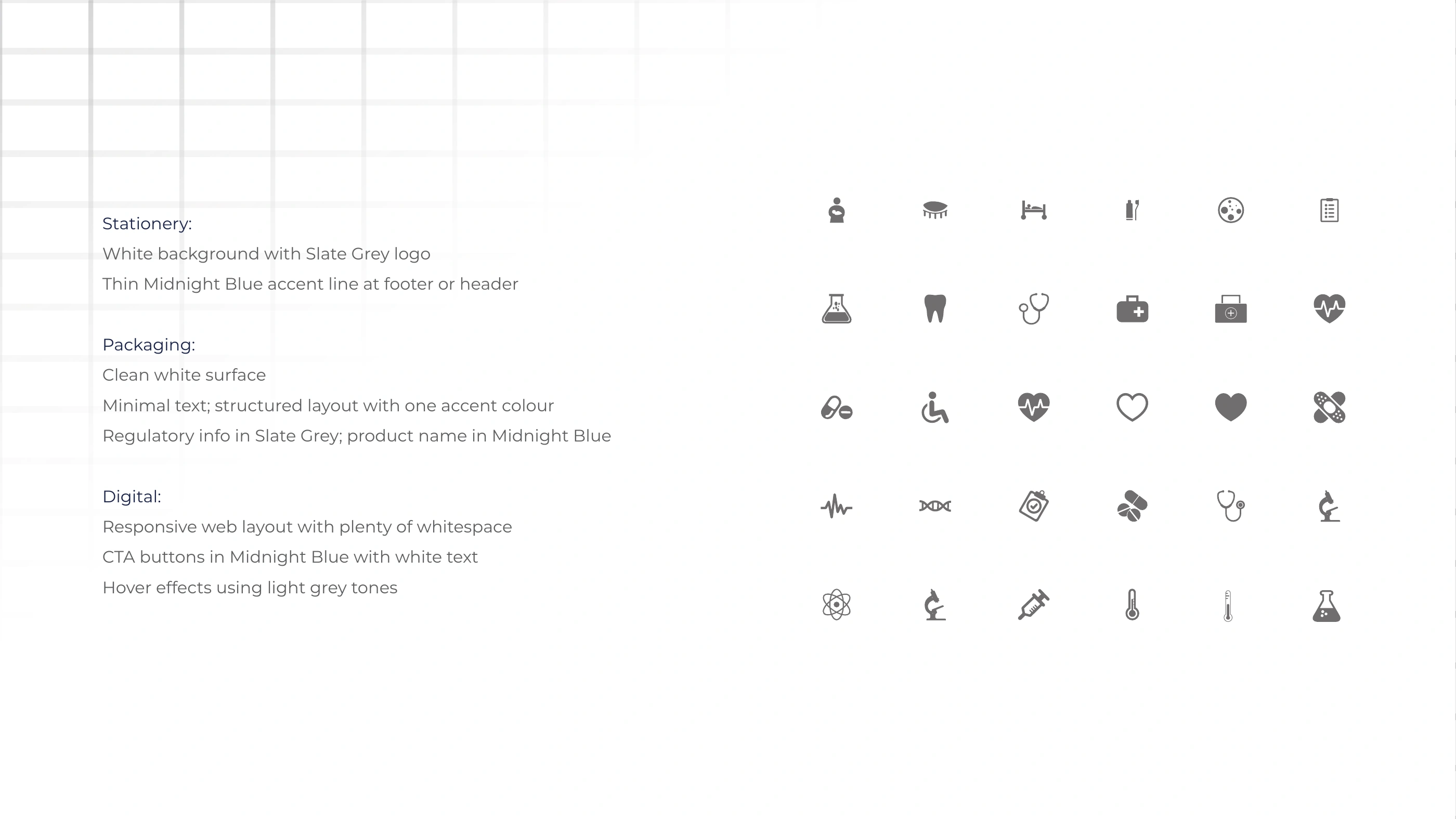
The imagery guidance and website concept show how the identity can extend beyond a logo sheet.
 Inspect artwork
 Inspect artwork
Inspect the original typography and application guidance
 Inspect artwork
 Inspect artwork
03 / Design evidence
What the work demonstrates.
A connected identity reference: visual character is translated into rules that another designer could apply.
Scope. Brand guidelines, art direction and application concepts. The website is shown as a concept, with no claim of a developed or launched site.
Read the selected guide (opens in a new tab)Continue exploring
Explore the logo collection All brand projects Discuss a project