I designed healthcare identities that connect a memorable name with a relevant visual idea. Explore how the symbols, letterforms and brand relationships work together.
Role
Logo design
Collection
6 identity groups
Includes
UroGuard & SecureLok
Evidence
Original logo artwork
Concept · Form · Application
One idea, made recognisable.
Each identity starts with a different visual problem: expressing movement, integrating a clinical cue or distinguishing a product within a wider brand.
The diagrams below unpack my finished artwork. They are retrospective portfolio explanations, rather than a record of original sketches or unselected concepts.
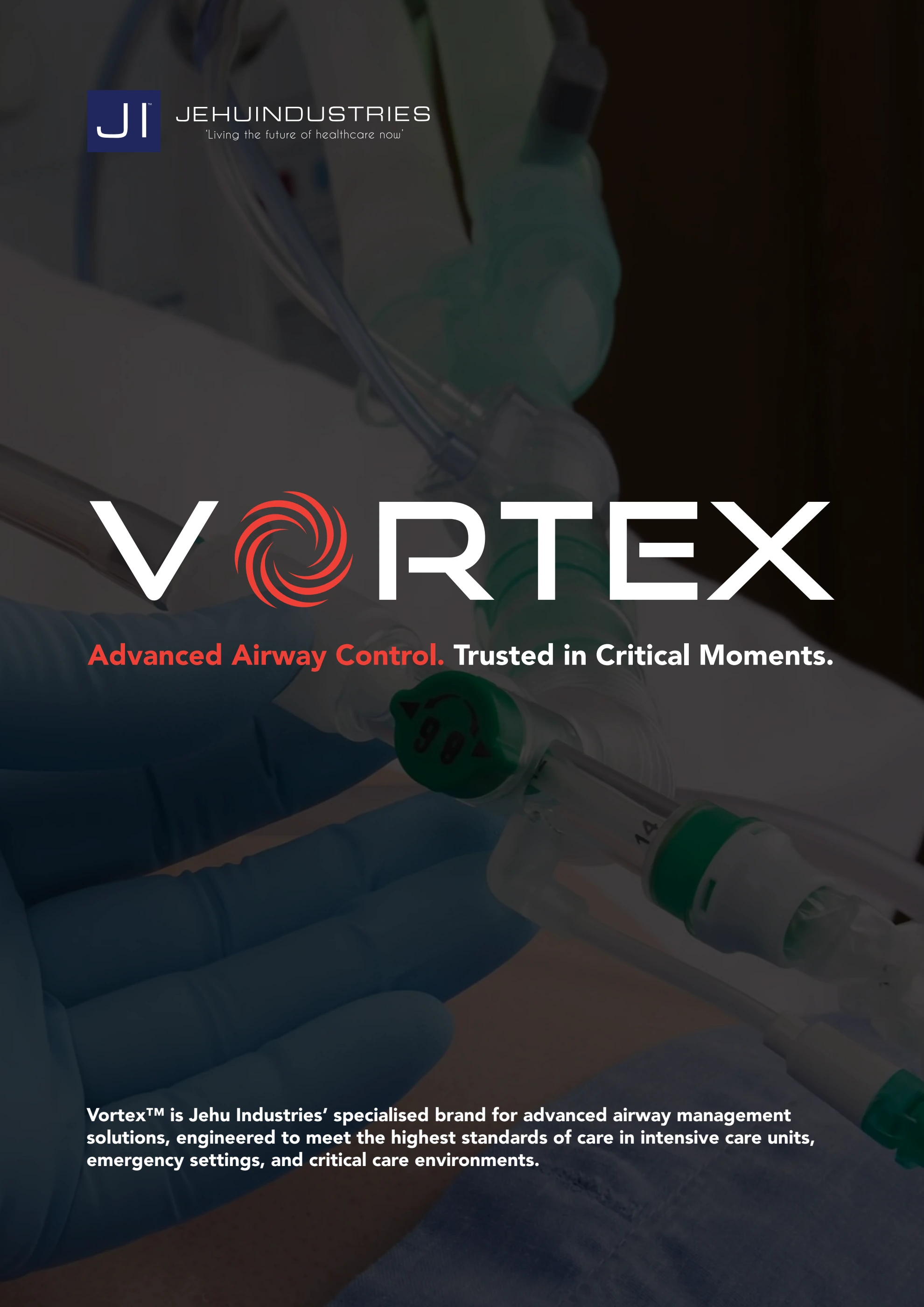
01 / Vortex
Let the symbol carry the name.
I made the spiral the identifying moment in Vortex, replacing the O while keeping the surrounding wordmark direct and geometric.
The parent name stays visible above a distinctive product wordmark.
Two lines, one locking device
The turquoise shape connects the C in Secure with the O in Lok. This simplified diagram isolates that relationship. The keyhole reinforces the name, while the stacked arrangement makes the product mark compact.
04 / Pure
Put the category inside the word.
I brought a fluid drop into the U, giving the infusion identity a relevant cue without adding a separate emblem beside the name.
The open pulse line contrasts with the solid lettering. Their connection supplies the defining detail without introducing a second colour.
The full mark keeps that relationship visible alongside the remaining letters, rather than relying on an isolated medical icon.
Identity in use
From a mark to a publication.
The Vortex and Inspire publications show how the identities move from isolated artwork into recognisable product communication.
Read this page Vortex: the wordmark and red accent lead the catalogue cover.Read this page Inspire: the identity becomes the focal point of the clinical flat lay cover.
 View original