
Original catalogue · October 2025 · 5 pages
The design challenge
Bridge a strong mark and technical detail.
The catalogue needs to introduce the brand and explain a product family. The wordmark carries recognition, while annotations and tables do the detailed communication work.
Read the publication01 / Design evidence
Let the identity set the direction.
The red spiral and angular letterforms give Vortex a recognisable signature. The catalogue carries that contrast into a restrained red, black and white system.

Original logo artwork
 Read this page
02 / Design evidence
Move from recognition to explanation.
The interior changes pace: product features and range information take priority over the large brand introduction.
 Read this page
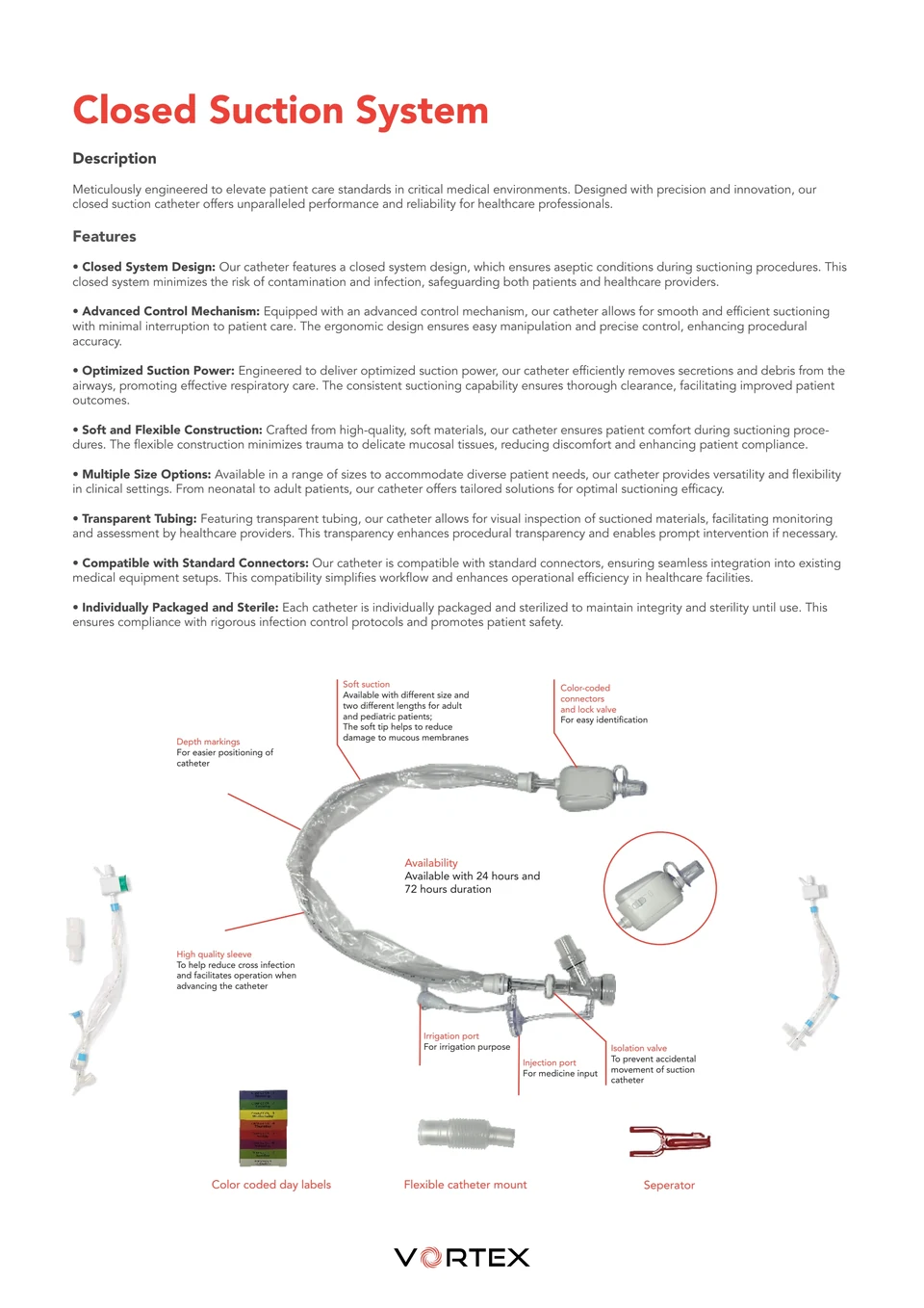
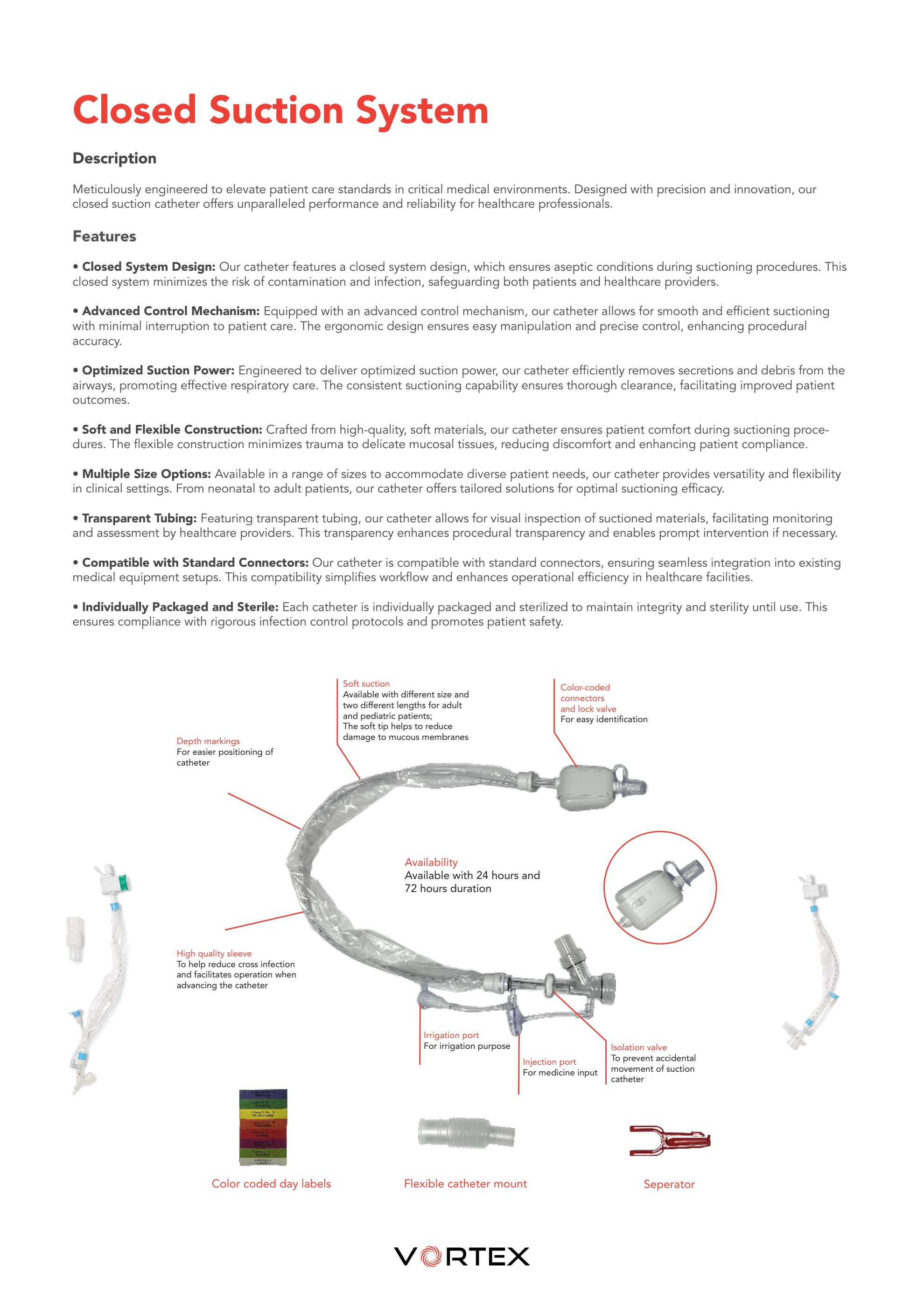
Connect the label to the part
Leader lines and close views make the product image explanatory. The image gives each feature a location instead of leaving it as an isolated paragraph.
Keep the accent functional
Red appears in headings, labels and key table details. Repeating one accent connects the technical pages to the wordmark.
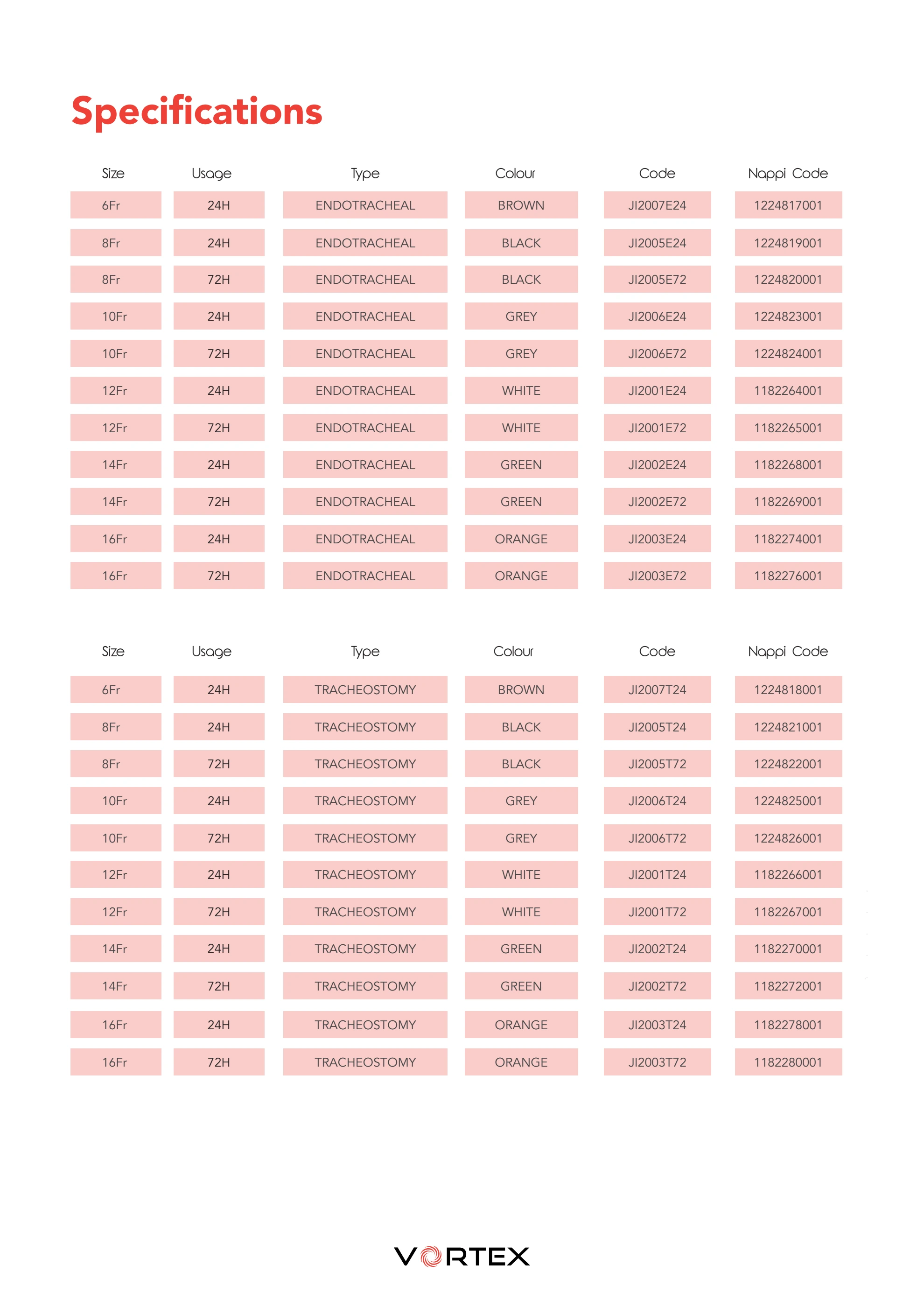
Separate the types of information
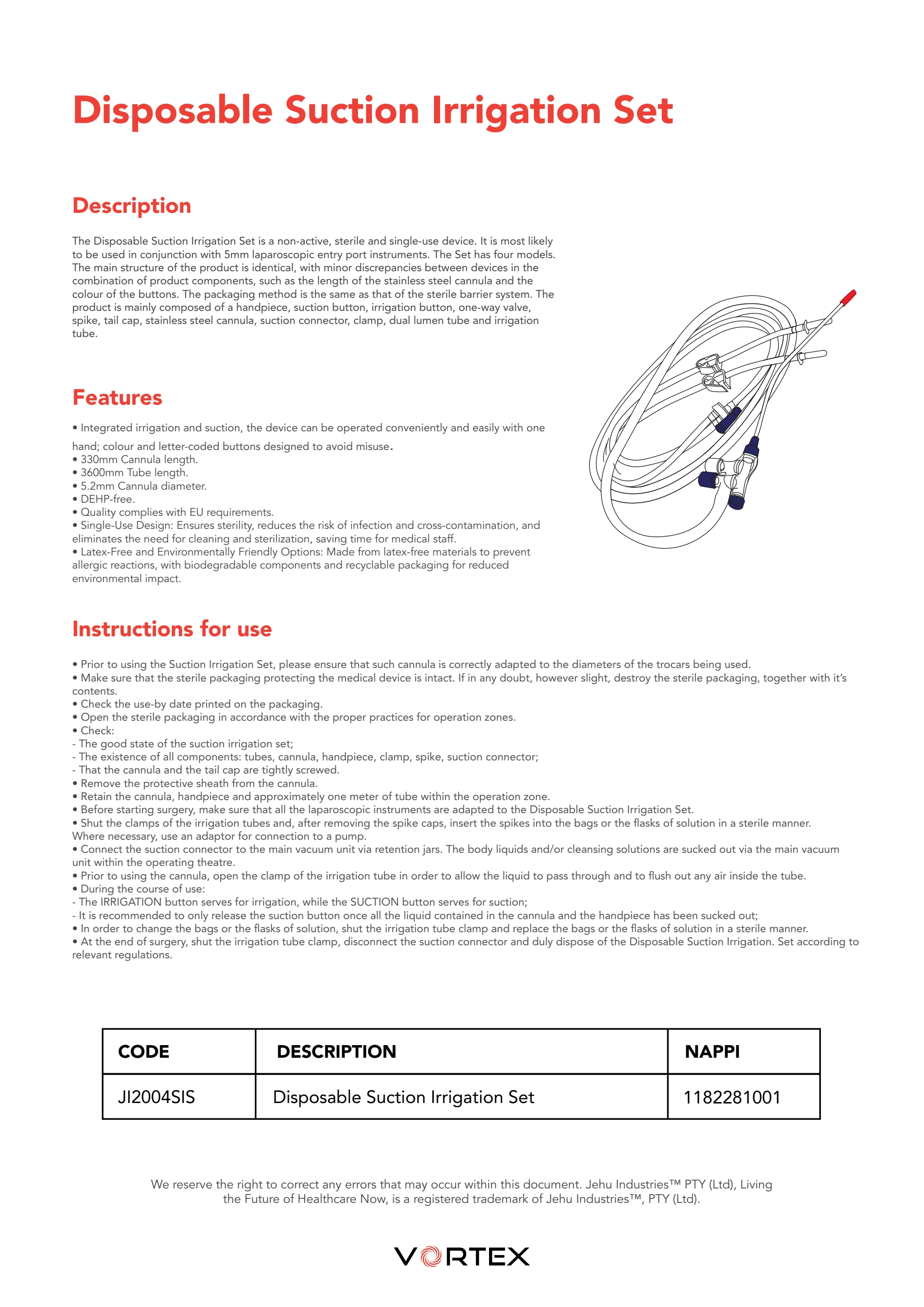
The product explanation and specification reference use different pages. This lets the image led introduction stay distinct from the denser comparison table.
Inspect the original specification and irrigation pages
 Read this page
 Read this page
03 / Design evidence
A complete identity application.
The strongest evidence is the connection between the mark, the cover and the annotated product page. The full publication remains available for closer inspection.
Original publication · 5 pages
Vortex Product Catalogue
Open the complete edition to inspect the page sequence and detail.
Further refinement. The small specification text and closely spaced annotations are the next areas to improve in a future edition. They are retained as original work here.
Continue exploring
Explore product image craft All brand projects Discuss a project