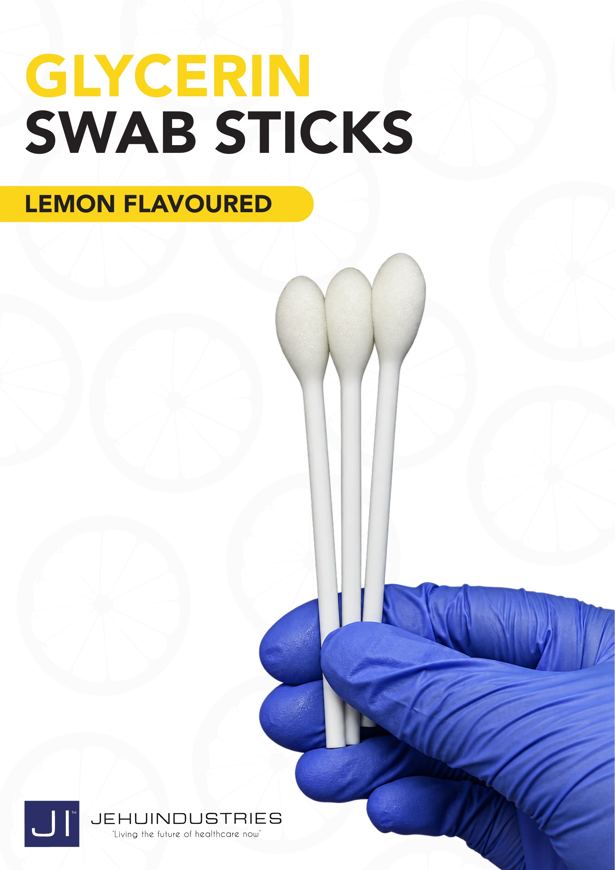
Complete publication · 2 pages
Lemon Glycerin Swabsticks
Browse the two-page communication with its AI assisted product-image refinement. The original wording and visual identity are retained.
Read brochure2024 · Jehu Industries
Bright citrus imagery and clean typography make the lemon flavoured product immediately recognisable. The design carries from the 75 swab carton to the three swab pouch and shipping artwork.
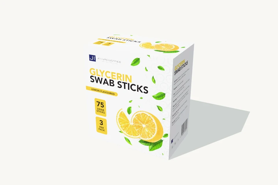
The carton and pouch form one coordinated product project.
The design needs to communicate a recognisable lemon flavoured product while distinguishing the total carton quantity from the contents of one pouch. The same identity then has to work on a much smaller flexible pack.
Retrospective design analysis · annotations prepared for this portfolio in 2026 from the original artwork.
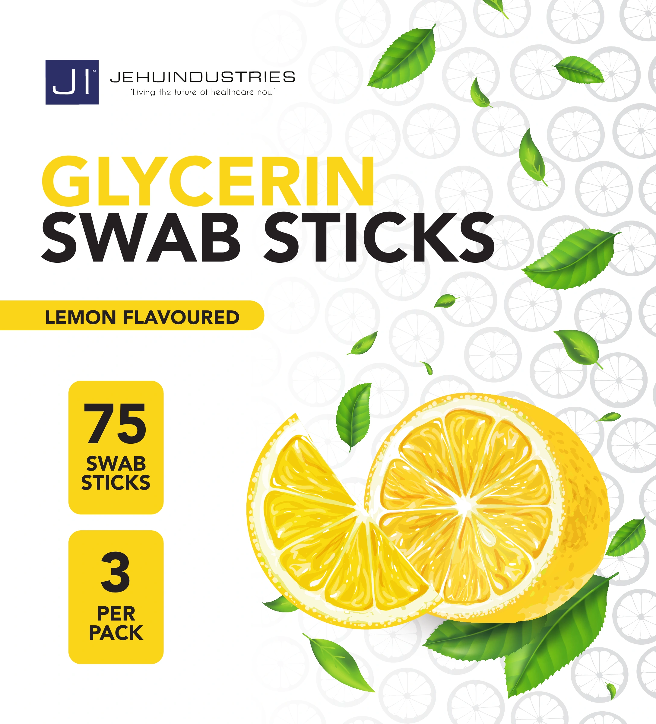
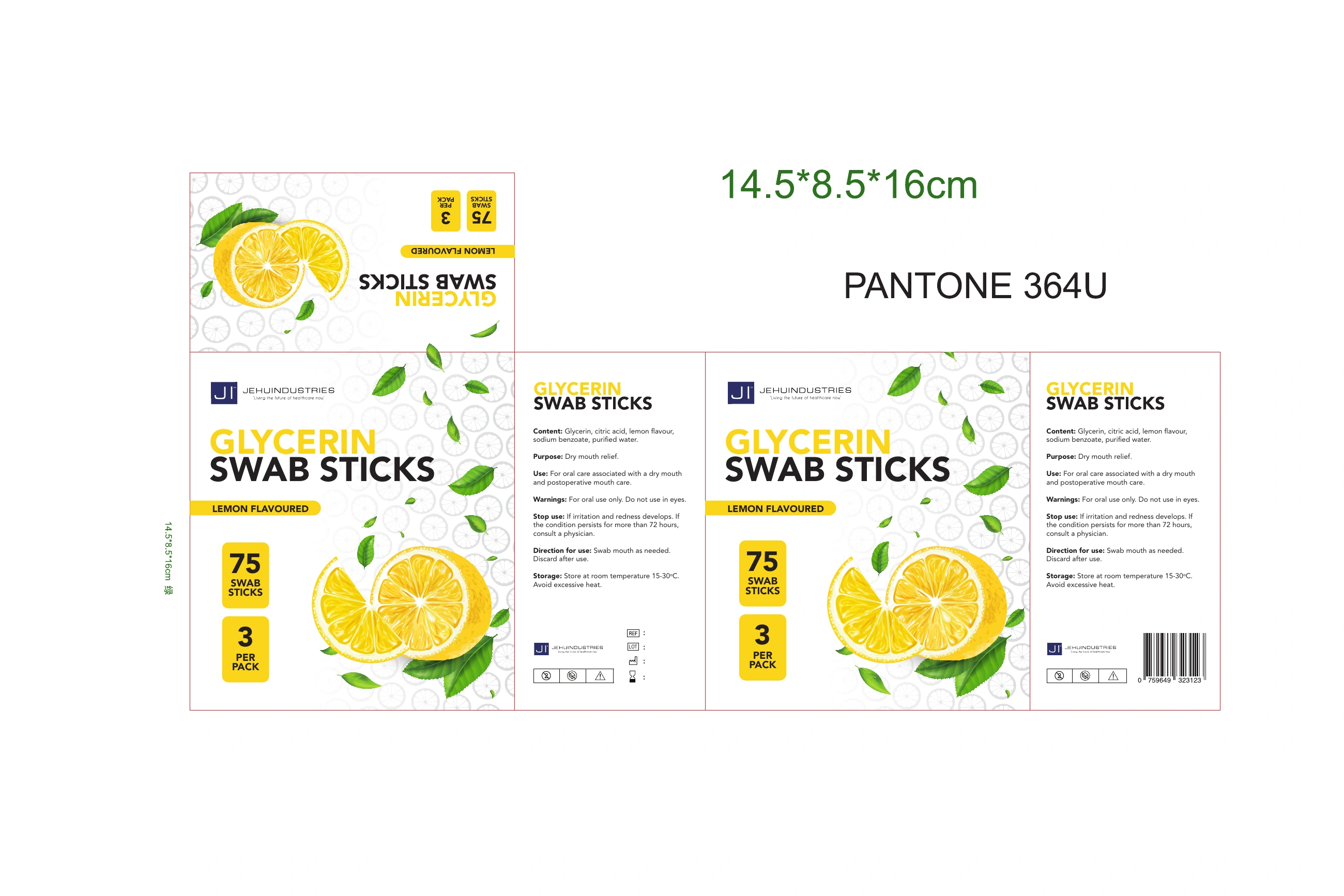
The large two line title establishes what the product is before the supporting detail. Black carries “Swab Sticks”, while yellow connects the name to the citrus palette.
Lemon imagery, green leaves and a pale citrus pattern recur on the carton and pouch. The written “Lemon Flavoured” label makes the meaning explicit rather than leaving it entirely to imagery.
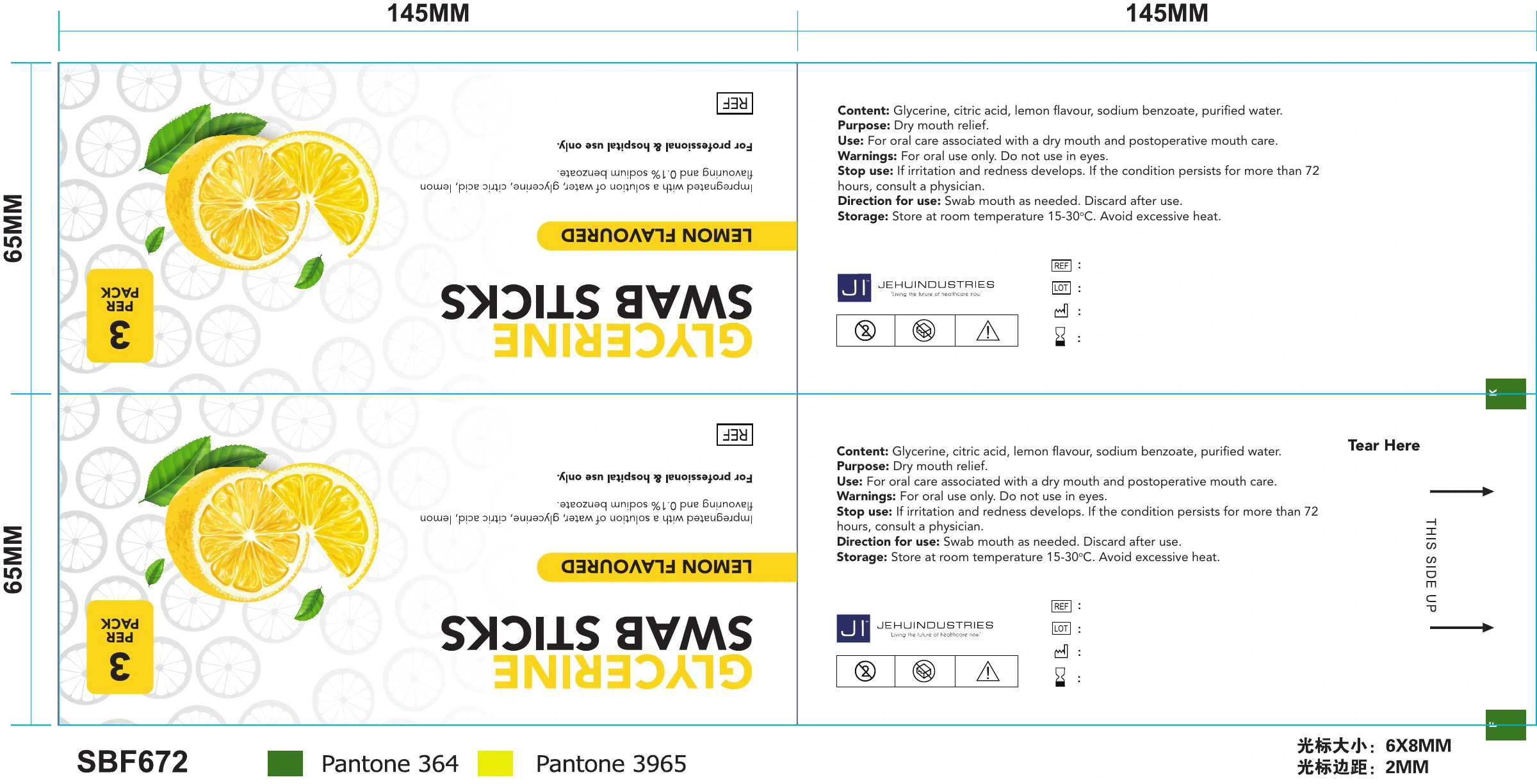
Two yellow blocks distinguish 75 swabsticks from 3 per pack. On the pouch, the three swab count remains relevant while the larger carton quantity drops away.
The carton communicates total stock; the pouch communicates the contents of one pack. The citrus identity repeats, while the count and arrangement adapt to the format.
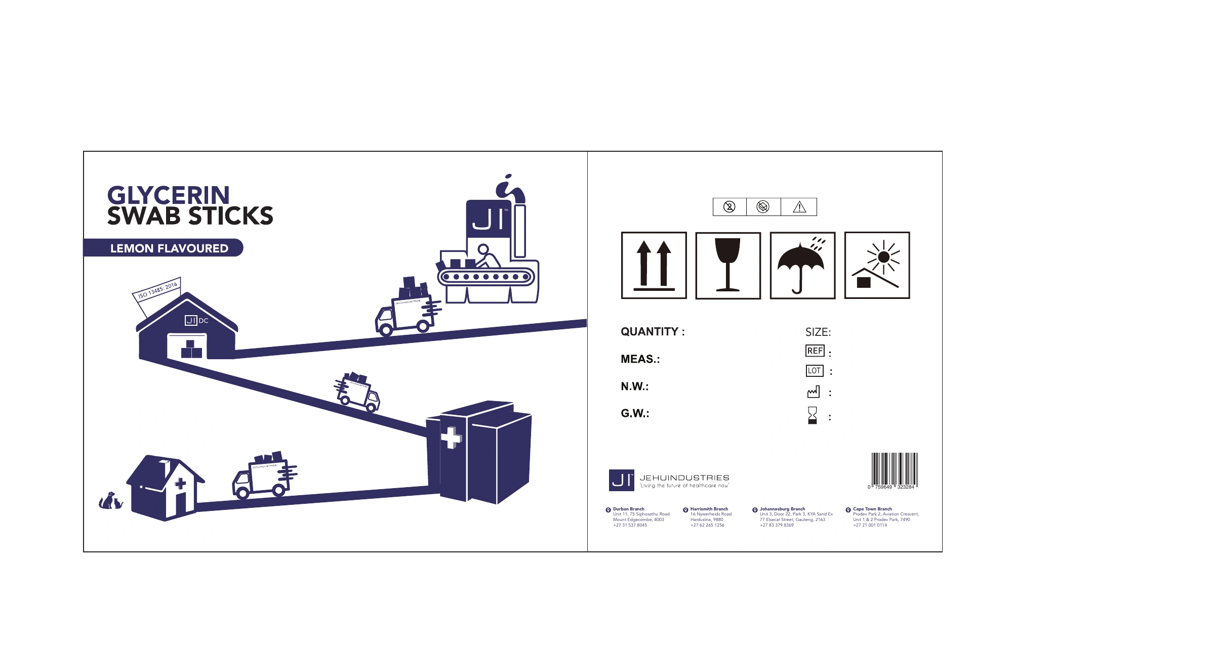
The carton, pouch and shipping artwork make the format adaptation visible. The pouch sheet also records dimensions, colour references and opening direction for production discussion.
Yellow lettering on white has less contrast than the black product name. A next refinement could use a darker title treatment and slightly quieter background pattern, then compare printed proofs while retaining the existing flavour and quantity hierarchy. This has not been applied to the source artwork.
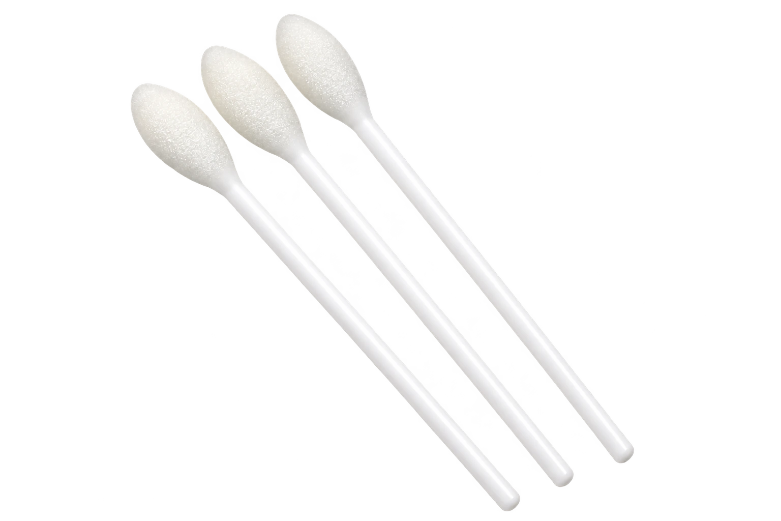
The refreshed communication shows an AI assisted refinement of the product photograph within the original citrus identity. The pouch carries the same visual language into a smaller format, where the three swab quantity needs its own emphasis.
 View full image
 View full image
Complete publication · 2 pages
Browse the two-page communication with its AI assisted product-image refinement. The original wording and visual identity are retained.
Read brochureA coordinated carton and pouch identity with different quantity messages for each packaging level, supported by dimensioned production layouts and two page product communication.
 View full image View full image
 View full image
Continue exploring
All product & packaging Selected Work Discuss a project