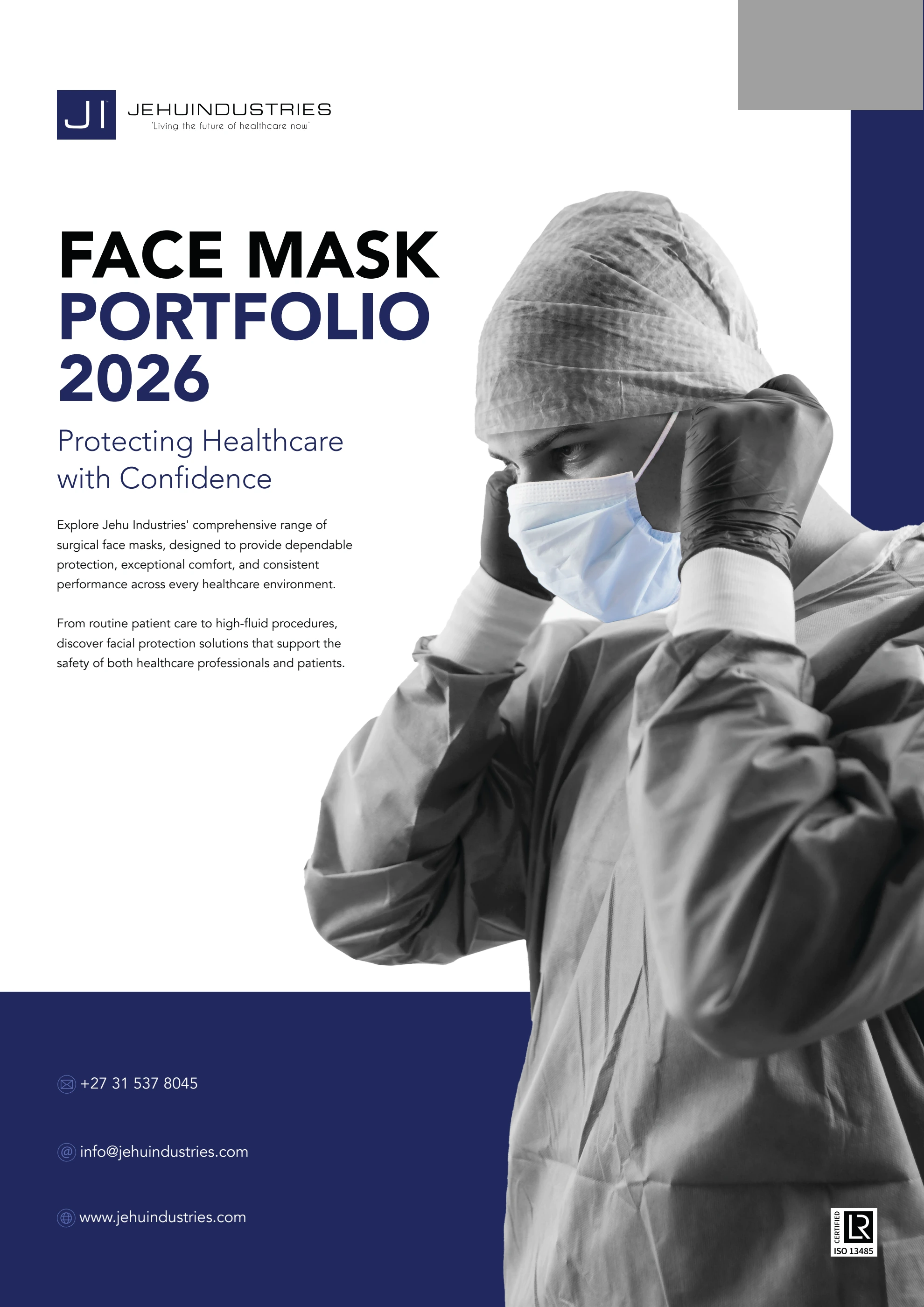
Complete publication · 8 pages
Face Mask Portfolio 2026
The dedicated eight page publication introduces the wider mask range, with contents, a comparison page and consistently structured product pages.
Read brochureOctober 2025 packaging · August 2026 brochure · Jehu Industries
Ties, earloops and visor formats share a recognisable packaging language. The design adapts to each carton’s proportions while keeping product type, quantity and essential information easy to find.
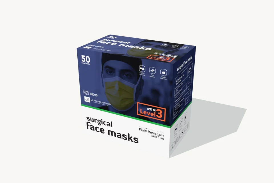
Choose a format to explore its original carton. All three mockups remain together in this project.
Ties, earloops and visor packs need to share a family identity while making their format differences visible. Their cartons have different proportions, so a single composition cannot simply be scaled to fit each one.
Retrospective design analysis · annotations prepared for this portfolio in 2026 from the original artwork.
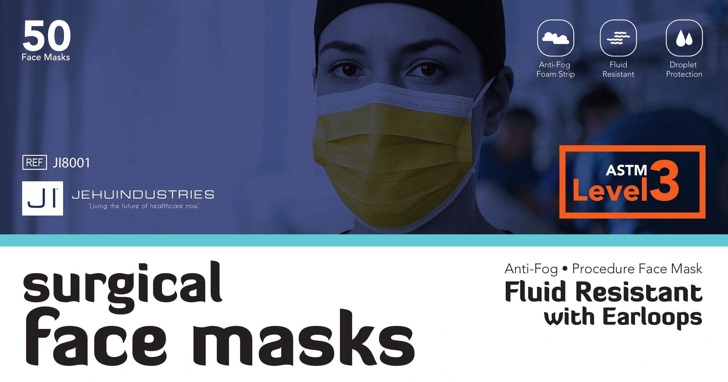
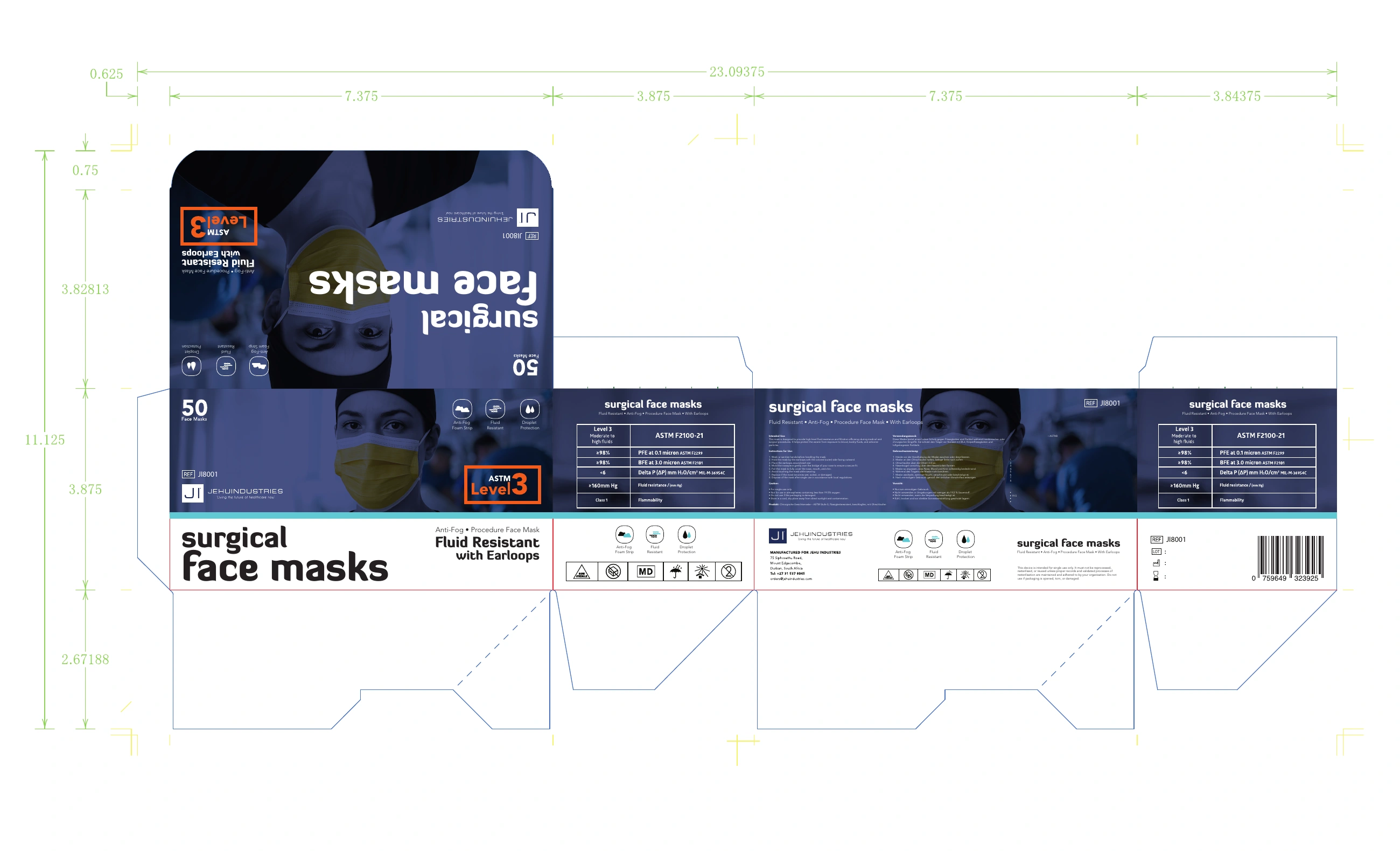
“With Earloops” sits in the white information area beside the category name. The ties and visor packs use the same position for their own descriptors, adding a written distinction to the visual family.
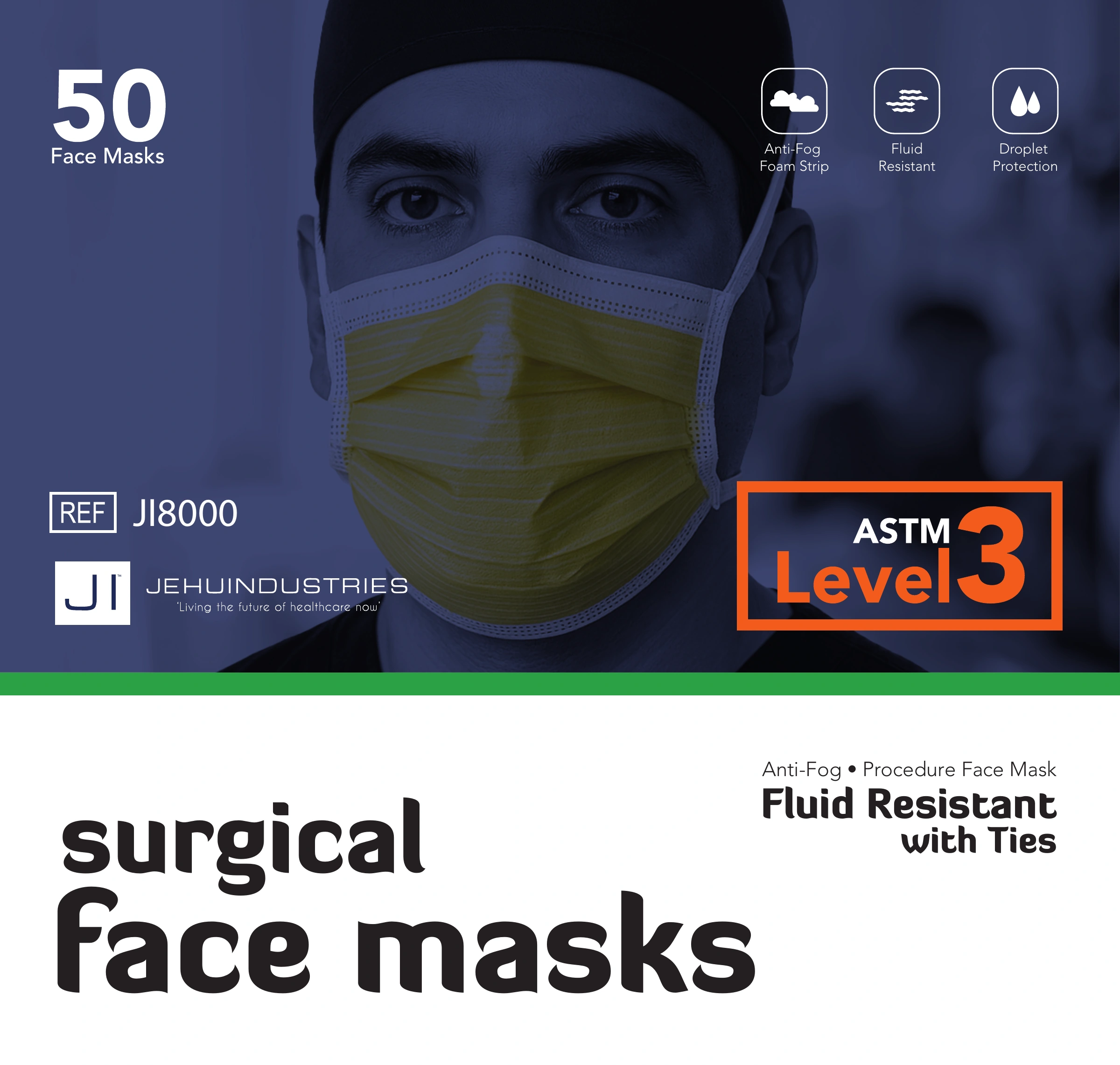
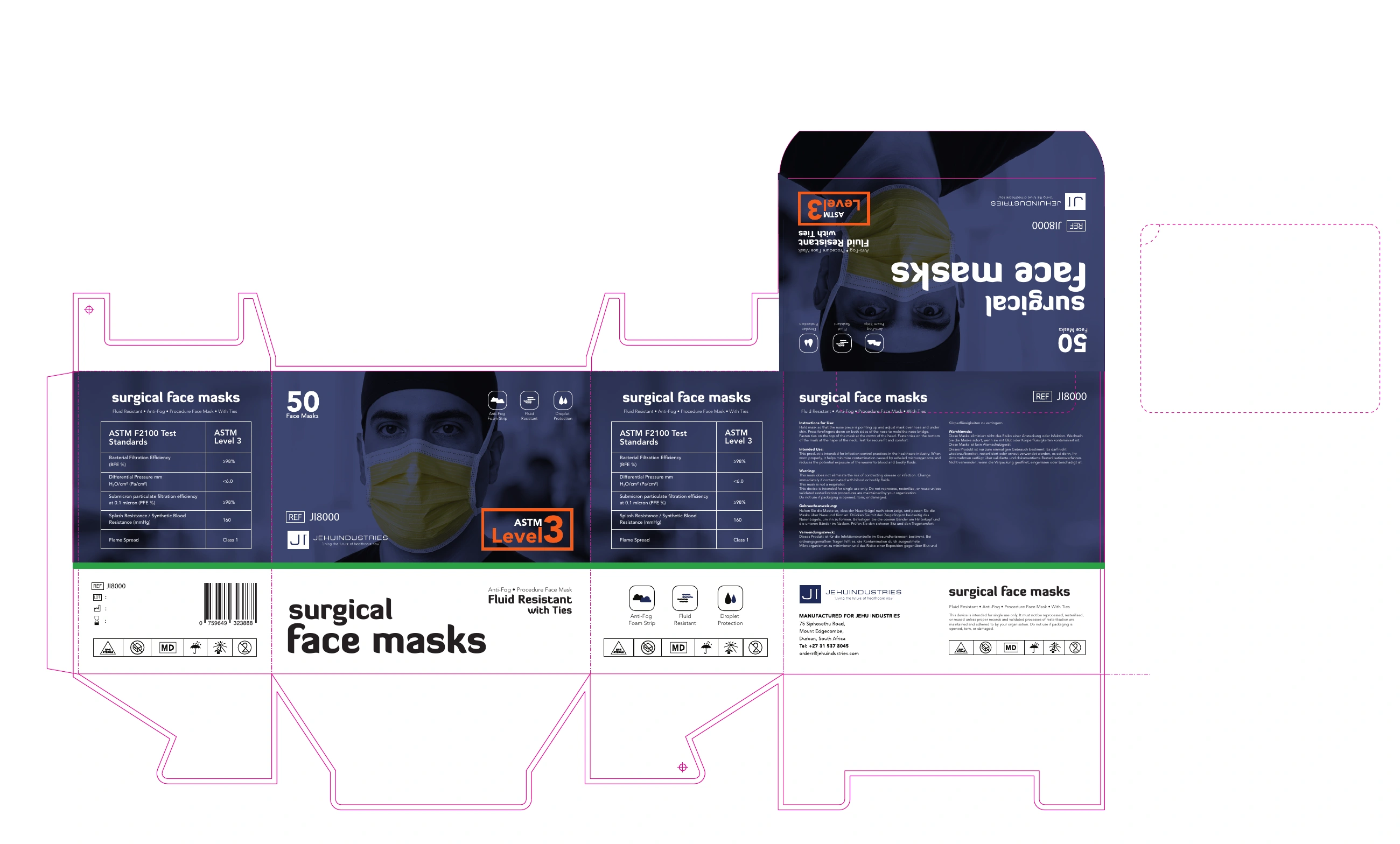
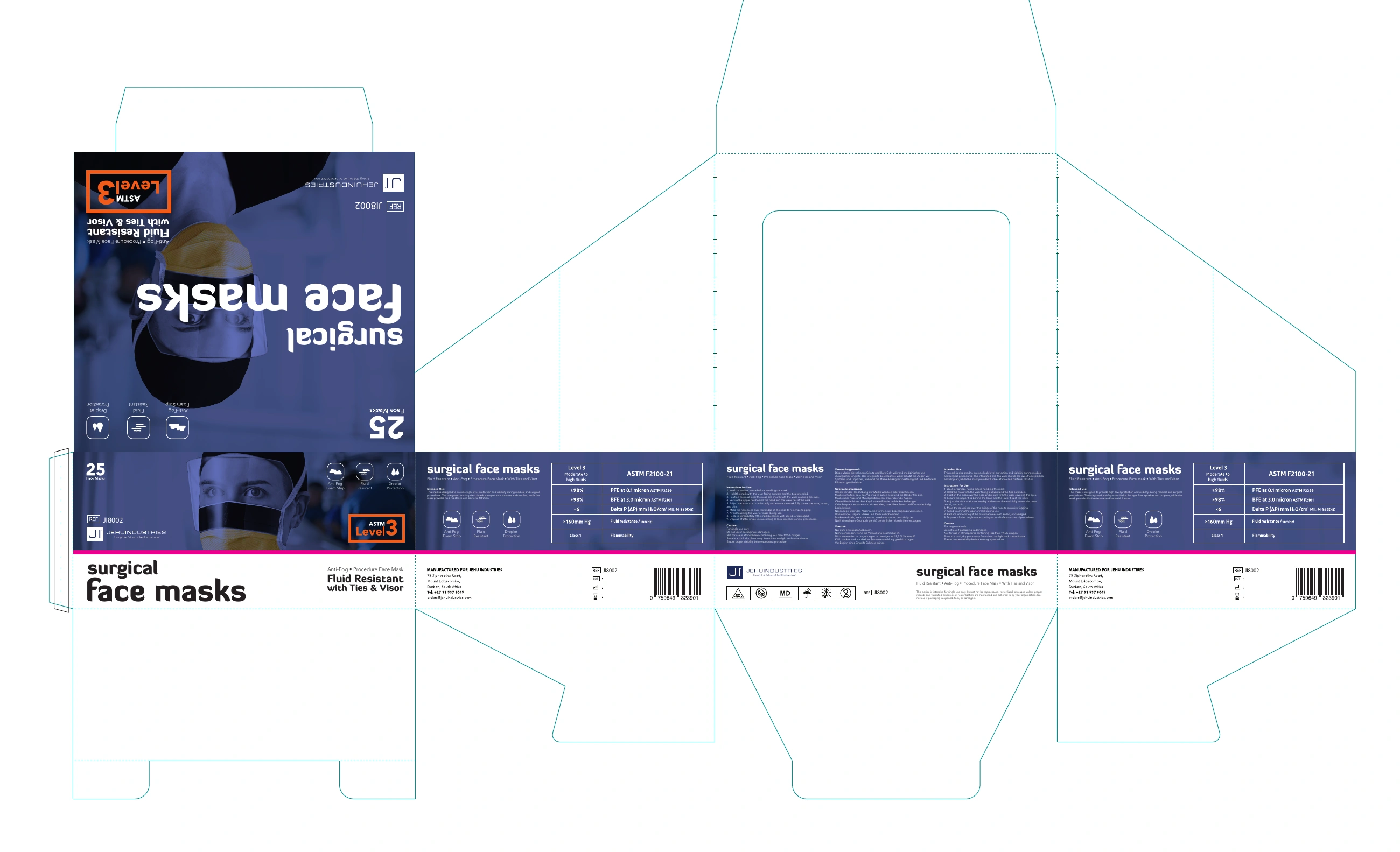
A narrow coloured divider creates a boundary between the dark portrait and the white typography area. Green, turquoise and magenta distinguish the three compositions without changing the overall layout language.
Quantity sits at the upper left: 50 on the ties and earloop packs, 25 on the visor pack. The source product portrait changes for the visor, while the information groups remain recognisable.
The taller ties face stacks the title over two lines. The wider earloop and visor faces redistribute the text and image. These are the original front panels, fitted to equal viewing frames rather than shown at physical scale.
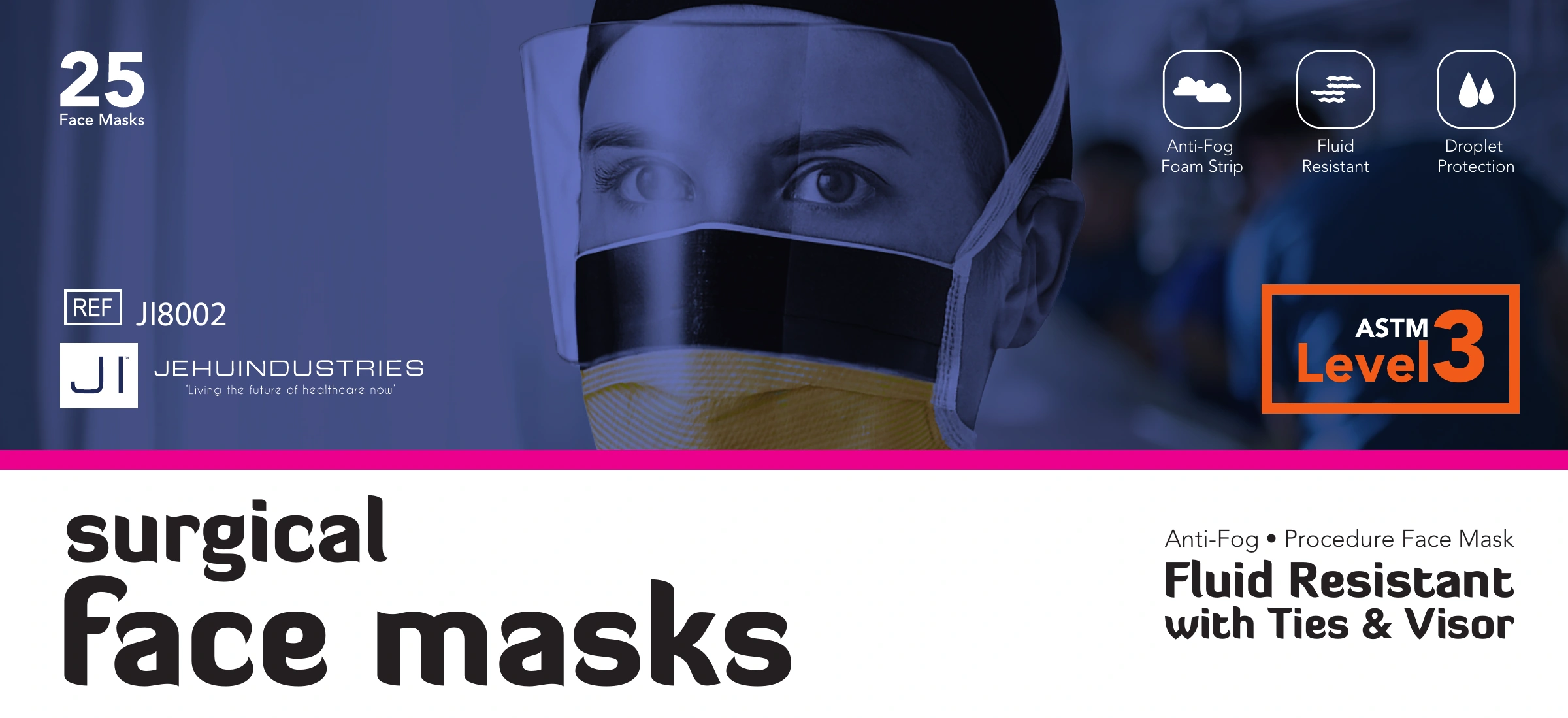
The packaging set uses three supplied carton structures. Image treatment and layout continue into the broader eight page 2026 brochure, which includes products beyond these three cartons.
The dark image treatment and prominent feature badge compete with the format descriptor. A next revision could give “ties”, “earloops” and “visor” more emphasis, then check those distinctions on a printed range proof. This is a proposed refinement, not a tested result.
The in use image gives the range a human focal point. Blue remains prominent against the monochrome clothing. The eight page brochure then organises the wider range, including the disposable adult and children’s masks, into a consistent product page structure.
 View full image
 View full image
 View full image
Complete publication · 8 pages
The dedicated eight page publication introduces the wider mask range, with contents, a comparison page and consistently structured product pages.
Read brochureThree structurally different cartons share a consistent visual language, with written format labels, colour dividers and quantity changes carried into a wider product communication system.
 View full image
 View full image
 View full image
Continue exploring
All product & packaging Selected Work Discuss a project